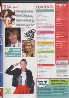
Page from Top of the Popsanalysed it, and commented on how the photographs used would represent the genders they are aiming it to.
From Top of the PopsColours used here seem to attract girls more than boys, also as there ae 3 good looking guys as the main image, and part of the title 'LOVE' seems to be more of a girl topic.
Good use of photographs here to fill in both pages and not leave blank spaces. Article aimed to a femae audience the title 'im not ready to marry' emphasises this point, as again it is a more female based subject of conversation.
One Photograph of the whole group is used here across nearly both pages, however only one man stands over the rest,maybe showing he is the subject of the article. Aimed to both genders, colours are quite simple and it doesnt show preference to one particular gender.
When planning my magazine I had a few ideas as to what I was going to name my magazine. However the name must portray the correct genre of music and also be apparent that it is to do with the music industry itself.
A few Ideas:
Beats
Rave
Base
Love Your Music
Love RnB
Music Vibes
I have been looking through exsisting magazines and found that they include more just one article about one person. So for my magazine to follow normal conventions I will be definately include the article promoting a new artist/band as that was part of the task that I was told to do. However as I want to follow the normal conventions of a magzine I will also haveto include extra information and other articles, this will help me know what to right as my "Lures" and "Coverlines" on my front cover.
I have thought about having a celebrity gossip section, where my readers will be kept up to date with any new and exclusive news on their favourite artists/bands, and what's new with their music aswell as their life in the eye of the public.
I also thought to add a section where the 50 or 60 top R&B hits will be listed and where they are avaible to dounwload or even buy on CD. This section will not only tell my readers of what music is 'HOT' or not but also who is number one at the moment and who is releasing new albums/singles. This page will contain a lot of information on music.
Seeing as my target audience are teens from the ages between 15-19, I know that most of them if not all of them will have a profile page on one of the major social networks such as 'Facebook', 'Tweeter' or 'Myspace'. So i was thinking of including in my magazine groups that they could follow to support their favourite artists/bands with their up coming music, and where they can be even more up to date and find out more information from a genuine place.
Taken outside in a garage, long shot, eye level, the model is situated on one side of the photo.
Also another image i have chosen to include in my double page spread.
Edited Photo
Opened this image with photoshop, filtered it using the "fresco" effect, changing the brush size, brush detail and the texture untill I was pleased with the effect it gave the photograph.
Taken outside on the estate, low angle (model is looking down at the camera), long shot, I decided to include this picture in my double page spread.
Image After Editing
Again using photoshop i filtered this image (edited it) using the "Film Grain"effect, I moved around the arrows on the intensity, grain and highlighted area, till I found the right effect that looked good.
Original Image
Picture taken in a house, piano as the prop, long shot, low angle.
I have decided that this image will be included in my double page spread aswell, after editing.
Edited Image
Image edited on photoshop, using thee "eraser" tool I erased the edges that looked out of place in the picture such as too much space between the floor and the model. This way the image will blend in with the page alot better.
Taken on the stairs in a block of flats, long shot, landscape, low level as she is slightly looking down towards the camera (eventhough she isn't looking directly at the camera). I decided to use this picture for my contents page.
Image After Editing
Opened the picture up with photoshop, then I used the "Eraser" tool to rub off parts of the edges with a ghostly effect so it would blend in with the rest of the page.
For my magazine I took many different types of photos but below are the ones that I wanted to include in my magazine, in the Front cover, Contents page and Double Page Spread.
Original Photograph Taken outside, she is leaning on a brick wall, long shot, low level as she is slightly looking down to the camera. This is the photo i decided to use for the front cover of my magazine.
Final image After editing
Photo after I edited it on photoshop using filter, Film grain. I then played around with the Intensity, Grain and highlighted area to create the effect that can be seen now on the final image.
I will be looking at the different types of photo shots that I can include in my magazine. I have searched online and found different images with different types of shots such as,Long shot, Midshot, Close up. Photos can also be taken at different camera levels such as; eye level, which would make the reader feel included with what is going on, High angle, which makes the reader feel intimidated and like they are looking up towards something, and Low angle, this would make the reader feel superior like they are looking down at someone.
Close up of Rihanna
(close up is usually a focused area of the object or body, here its focused on her face which shows a lot of detail and emotions)
Long shot of the Saturdays
(long shots, usually show the whole object or body, which shows the setting of where the photo was taken, lighting and how, as shown above)
Mid Shot
(mid shot usually include from the waist upwards)
After doing research I have taken some of these shots into consideration for when I am taking my photos. I will take a wide range of different types of shot and angles so I have a better choice of which photo to use and how it will come across to the reader.
In class we were asked to produce a flat plan of ideas of the different photographs we were thinking of taking.
Photoshoot flat plan
The singer is standing infront of the microphone. Microphone being a prop to protray the musical side, and enphasis that it is being used for a music magazine.
Lomg shot or mid shot of my model sitting or somewhere near the piano. Again another prop being used.
Mis shot of my model, wearing headphones, looking towards the camera. This photogrpah will also be taken with the headphones so I can see which ways better.
Model will be sitting on a bench or a table, posing however she wishes, this will be a long shot, however I will like to take this picture from many different angles.
The masthead in this urban music magazine "VIBE" has been done in a quite simple yet bold font, acroos the whole top part of the page, all in capitals, maybe to stand out even more to the reader. The masthead is also made to stand out by its black colour contrasting against the white/grey background.
Top of the pops is a more girl based audience, which explains the load of pink in most of the front cover including the masthead. The masthead compared to other magazines is in lower case letters and goes across the whole top part of the page. The bubble writing emphasises again their target audience and suggests a 'bubbly' and happy sort of character usually referred to kids/younger teenagers. However the masthead successfully portrays the genre of the magazine which is 'Pop.
This is the masthead of a rock/indie music magazine called 'Kerrang'. The font is in capitals and white, which contrasts against the black background, making it successfully stand out to the reader. The lines going through the font give it the effect that it has been shattered, just like a mirror would if it was hit by a hard object. Suggesting some attitude and a rebellious character to the magazine, artists and fans. The name itself 'Kerrang' is onomatopoeic, as it sounds like a guitar being played or the guitar strings strung with force.
Seeing as I have chosen to base my music magazine on the genre of 'RnB'. I went and done some research on existing music magazines with the same genre.
Below is some information I found out.
Music Genre: Urban/RnB Appearance of artist and fans: (Girls) Leggings, Jeggings, low-cut tops, skinny jeans, heels, bodycon dresses, make up, long straight hair.
(Boys) Jeans, designer trainers, checkered shirts, ear peircings, short hair (shape up, mohican etc.) Lifestyle Entertainment choices: Clubbing, restaurants, hang out with friends, parties, holidays, shopping, (some may do drugs,alcohol,sex..etc) Artists: Trey songz, Beyonce, Ciara, Drake, Usher, Chris Brown, Jason Derulo, Keri Hilson, Rihanna..
The link above is a music video which goes with the music genre of the magazine I have researched.