Wednesday, 5 January 2011

How did you attract/address your audience?

My mode of address will be mainly aiming towards boys and girls who like and listen to RnB/Urban music, between the ages of 15-19. My front cover design and layout are very eye catching so it can stand out to the readers and make them take an interest into my magazine. I used bold colours but still managed to keep it simple so the magazine wouldn’t look too overdone.  I will not be using “girly” colours such as Pink and Purple and I will try not to make it too masculine, I will use the right colours to attract both genders. For the masthead I decided to use ‘RNB’ with a small music note overlapping it. This clearly helps to highlight the genre of RnB and the use of a bold blue as the colour will help it stand out to the reader and catch their attention.
However the use of slang terminology targets my target audience because they are most likely to be very familiar with it as it is a youthful/trend nowadays. My magazine readership would be advertised in music channels such as “Smash Hits” or MTV, or on pop ups that appear on facebook, as after doing some research my target audience tend to watch music channels and the majority of them use facebook/twitter/internet almost every day. Throughout the magazine the consistency of the writing and eye catching colours has also helped the magazine reflect what kind of audience it is aiming at. I think my choice of colours is good as they ‘Blue, Yellow, White and Black’ suit both genders equally, therefore not making my magazine too girly or too masculine.




How does you media product represent particular social groups?


View more presentations from Jennifer2394.

What have you learnt about technologies from the process of constructing this product?

During the process of constructing my product there were many challenges with the programmes I used which were, Photoshop and Pages, in particular. However it was very enjoyable learning more in depth of how to use them and make the most out of them. I decided to use Photoshop for my front cover and contents page, I learnt a lot about it as, when starting my media course I knew very little of how to use it. Once you have the hang of it, it is a very useful and interesting programme as you can experiment with many different tools and use lots of layers to create something you like. It is also very good to use if you want to edit photographs, which is why I used it for my front cover in particular.  Pages the programme used to create my double page spread it is a lot simpler to use than Photoshop, but however doesn’t include all the advantages which Photoshop has. However I learnt how to use it quite quickly as it was something new to me, but I enjoyed experimenting with it and being as creative as I could.


All the production work was done on Macs, which I wasn’t used to as I only use a normal PC, but I eventually learnt how to move around and do things on the Macs such as; screen grabs, which is the same as a print screen on a normal PC. I could then use those screen grabs and include them onto my blog as evidence of my work in progress and research.  I have learnt that Macs even though they may be more complex than a regular PC, they are very useful as they include more editing programmes allowing me to be able to expand my skills on those different programmes.
For my final product I had to include photographs I had taken myself (original). This I enjoyed quite a lot and I found it the easiest task to do and also that I could be as creative as possible when taking the pictures. I learnt what angles looked best for specific poses and all the planning help me come up with even more ideas o what and where to take the photos.

In what ways does your music magazine use, develop or challenge form of convections of existing music magazines?

Having chosen the genre of R&B for my music magazine, I have decided to do some research on a magazine called “VIBE” which is also based on the same genre. I already knew the codes and convections from previous work I’ve done during lesson. With that knowledge I could then analyse the VIBE magazine and find out if it follows most of the codes and convections like the rest of the music magazines. During class work I have also looked at Top of the pops magazine which genre is Pop. Both magazines were very different in the way they looked, top of the pops had a mix of bright and in your face colours whereas ‘Vibe’ had more simple and more sophisticated colours. However through the colours used, the design and the language used, they both successfully portray their target audience. They both also used the normal convections of a music magazine, such as Masthead, Lures, Strapline, date, issue number, Coverline, Barcode, Price, image, Mode of address. These are convection that my magazine must also include to show that it is a genuine magazine and professionally done. The contents page must therefore follow the convections too which are, page numbers that indicate what story is on what page, message from editor to make it seem like the editor is wanting to connect with the readers, images can be useful to give an insight of what else is in the magazine. There will have to be a consistency of style, colours and fonts from page to page of the magazine, otherwise too much is happening and it might portray the wrong target audience. Convections for the double page include, title, Strapline, the actual article/interview and photographs (so the readers know who the article is about).


I would say my magazine follows the normal convection of a magazine and therefore looks genuine and professional, and I have successfully portrayed the target audience in the appearance and language of the magazine.

Magazines Online

Kerrang Webesite

Top of the Pops

Vibe Online Magazine


I have researched some websites of magazines I have analysed over time. There are a few similarities between the paper magazine and the one online. However I think it is a good way to target the audience if they are between the ages of 16-24 as they are frequent users of the internet and are up to date with internet news.

Tuesday, 21 December 2010

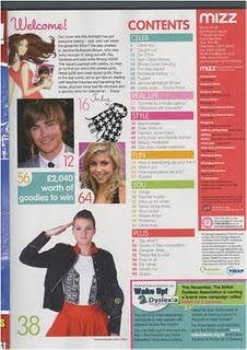
Contents Page Research


After research differnt types of contents pages, all the different ideas used in each one has help me to think about how mine will look like.